


What Is Mobile SEO?
Mobile SEO stands for mobile search engine optimization.
It’s a search engine optimization technique that helps improve the visibility of websites in mobile-device search results. It also improves the user experience by being responsive to the different demands of the website on mobile.
A mobile-friendly site:
- Loads fast and properly on mobile devices
- Allows mobile users to navigate the site with ease
- Has readable content that does not require readers to zoom in or out
- Offers users value equivalent to or exceeding their desktop experience
When you invest time in Mobile SEO best practices, this leads to improved organic traffic, which is traffic coming to your site directly from search results.
Why Is Mobile SEO Important?
Mobile SEO is essential to having a successful website! Here are four major reasons why:
1. Mobile Search Is Huge and Growing
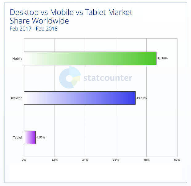
The majority of users that are searching online are searching from mobile devices, greater than desktop and tablet users by a significant margin. And the difference is continuing to grow in favor of mobile.
That means that most of your target customers are likely using mobile devices to find content. Improving mobile SEO means they’ll be able to find yours!
2. Google Search Ranking is Based on Mobile
Google switched to a mobile-first index, which means it’s using the mobile content of a web page to determine its search engine ranking. That means mobile should be the highest priority in order to ensure high rankings.
3. Mobile Search Largely Influences Sales
Mobile is also driving presale searches. Google’s research shows that:
- Mobile searches for product reviews have increased by 45%, which means that pre-sale research is likely taking place on mobile.
- People have spent the equivalent of 50,000 years of watch time looking at video reviews on mobile devices.
In addition, many people actually prefer to use mobile devices to complete the whole shopping process due to convenience and ease.
Overall, mobile search optimization will help you reach your customers wherever they are in the buyer’s journey and ultimately this boosts sales.
4. Mobile SEO Affects Voice Search
Mobile optimization will also help you future-proof your SEO strategy. That’s because voice search is becoming huge, mirroring the rise of mobile search. Plus, using mobile SEO to optimize for voice search now could provide a competitive advantage since it still isn’t common practice among businesses in 2024.
Mobile SEO importance Recap:
Overall mobile SEO is vital to a healthy website and to any digital marketing strategy because
- Mobile Search is Huge and Growing
- Google has Mobile-First Indexing
- Mobile Search Leads to Sales
- Mobile Search is Tied Voice Search
So, when you optimize for mobile search you set yourself up to succeed across the board.
Accessily’s Top Ten Mobile SEO Tips
Now that you know why mobile SEO is so important, it’s time to start adapting your plan for your mobile users. Let’s take a look at the top ten best practices for improving your mobile SEO strategy.
Mobile SEO Tip #1 : Improve your site’s load time
Your site’s load time is an integral part of the mobile experience. When users search for information on-the-go, they want to access it quickly.
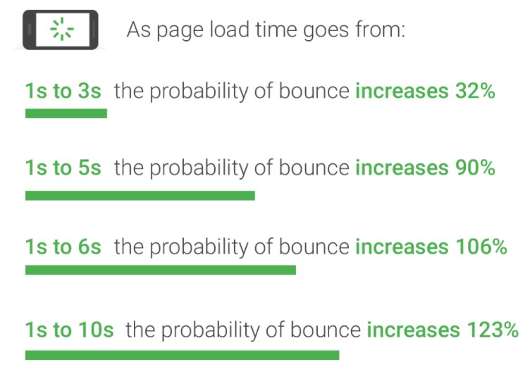
Poor speed leads to increased bounce rates for websites. As load time moves from one to ten seconds, the bounce rate increases by 123%.
To keep leads on your mobile site, you must improve your site’s load time. Google PageSpeed Insights will provide you with information on your site’s load time.
The best practices to increase page speed include:
- Compress and optimize images. When not optimized, images take up lots of bandwidth. They are large, which means they take longer to load. You can also consider using JPEG format instead of PNG.
- Minimize HTTP requests. These requests are for the different elements of a page as it loads. They include images, stylesheets, scripts, and images. The more on-page components your page has, the longer the page will take to render.
- Upgrade your web hosting once your site has more content and more visitors. Upgrading can increase your site speed.
- Remove unnecessary plugins. The more plugins you have on your site, the more resources they need to load. Remove those you no longer use by deactivating or deleting them. Too many plugins will not only slow down your website but may also lead to security issues and crashes.
Mobile SEO Tip #2: Integrate responsive design
Responsive design is a crucial component of creating a mobile-friendly website because the website format changes based on the device being used. When you integrate responsive design, you ensure that your website adapts to any device a user uses. Whether it’s a smartphone or tablet, your audience will get the best experience for their device.
For example, your website will look different depending on the device be it a tablet, mobile, or desktop. The elements change to optimize for the screen on which they appear.
The site will change either based on text or content. A responsive design will eliminate or enlarge text depending on-screen type.
You can optimize your website design for responsiveness by:
- Scaling images for mobile users. Sometimes, even with a responsive design, the images cover the whole screen leaving no space for a call-to-action. So you need to make sure that you scale your images for mobile users.
- Having an easy to view navigation menu for mobile users. They should be able to easily navigate from page to page, using an easy-to-access site menu.
As people continue accessing content on the go, a responsive website design gives your site a competitive edge. It also makes it easier for them to shop and increases conversions.
Mobile SEO Tip #3. Focus on the user experience
This next tip goes hand-in-hand with responsive design. If you want to be successful with mobile-friendly SEO, you must focus on the user experience.
Responsive design is part of a positive user experience. When leads can access and browse your site easily on mobile devices, it provides a positive experience for them.
There’s more to your website than just integrating responsive design. While responsive design is an excellent stepping-stone to creating a better mobile experience, you need to add other elements to your plan to ensure it boasts a great experience for users.
- ‘Thumb-friendly’ design: When you’re designing your mobile site, you must make it easy for your audience to scroll through and click on elements on your page.
- Easy-to-find calls to action (CTAs): Call to action (CTA) buttons help your audience take the next step towards conversion. When you create a mobile-friendly website, ensure that your CTAs stand out on the page and are easy to find.
- Ensure font is legible on smaller devices: Since users browse your site on devices with smaller screens, you must make fonts readable on these devices.
Mobile SEO Tip #4: Be Careful with pop-ups
Pop-ups are an effective way to draw your audience’s attention to a certain action. Whether it’s to sign up to receive emails or download free content, many companies use pop-ups to draw the user’s attention towards the action you want them to take.
Specific actions can trigger a pop-up to appear on the screen. It may be when someone first enters a page, when they scroll to a particular part of the page, or even when they move their mouse to head back to the search results. Pop-ups effectively help catch your audience’s attention and get them to look at the vital information you want to share.
However, these pop-ups can be an issue on mobile devices. If your pop-up takes up the entire screen on mobile, it will leave users frustrated. They won’t be able to see the information that they visited your site for, and they might not understand how to get rid of the popup. This could cause users to leave your site.
If you’re going to use pop-ups on your site, be careful of how you use them. You don’t want to use too many pop-ups on mobile devices because it can drive people away. Use them sparingly and on parts of your page where the pop-up matters most, and it won’t cover important information.
You should also make sure that your pop up displays an easy way to get rid of them, like a prominent “x” at the top.
If you want to be effective with mobile SEO, exercise caution when using pop-ups on your page.
Mobile SEO Tip #5 Optimize for local
An essential part of mobile SEO involves local SEO. Mobile searches using the phrase “near me” occurred three times more in the past few years, meaning that more and more users search for local businesses.
People often search with phrases like “near me,” “open now,” and “where can I buy” to find local businesses near them. With so many people searching using local phrases on mobile, you must adapt your strategy to reach these people.
You can adapt to local searches by using local keywords. A keyword like “Best Bakery, Trenton NJ” is an excellent example of a longtail local keyword. If someone searches for a local bakery, they’re likely to search “bakery [city]” to find one.
For more local SEO tips check out our comphrenshive local SEO guide here.
Mobile SEO Tip #6: Make Sure Your Navigation Bar is Simple and Intuitive
Your navigation plays a vital role in how users find and access information. If your navigation is too challenging to use, users will get frustrated and leave your site. To ensure you’re creating a positive environment for your audience, create mobile-friendly navigation.
The best way to create mobile-friendly navigation is by using a hamburger menu. Hamburger menus appear at the top of a page with three lines. When users click on this button, they’ll see a drop-down menu with all the different pages they can visit.
A hamburger menu makes it easy for you to keep your navigation organized for your audience. It keeps your site clean and is easy for your audience to use to find information.
Mobile Tip #7: Optimize title tags and meta descriptions
An essential part of mobile SEO is your title tags and meta descriptions. These two elements determine whether someone clicks on your listing in the search results.
Title tags
Title tags are the first thing your audience sees in the search results. These tags tell your audience what your page covers.
These title tags serve as a preview of your page. If you want to drive more relevant mobile traffic to your site, you must optimize your title tag by using relevant keywords.
Meta description
Your meta description is the short blurb your audience sees after your title tag. It provides your audience with additional information about your listing. On mobile, these previews are shorter than desktop so it is more important to be short and exact. You’ll get more mobile users to click on your site if you have relevant and catchy meta description that is as short as possible so that they see the whole thing.
Mobile SEO Tip #8: Create a separate mobile URL
When companies optimize for mobile, many will create a different mobile URL. With a separate mobile URL, you create a parallel site for mobile users. It allows you to create a custom experience for people who visit your website through mobile devices.
A mobile URL typically appears as “m.website.com” or “website.com/mobile.” When users enter your site through a mobile URL, they see a version of your site that’s adapted for mobile devices. This adaptation allows users to experience your site.
Mobile SEO Tip #9: Create mobile content
A great mobile SEO tip is to create mobile content. When you create mobile content, you format it to provide a positive experience on mobile devices.
If you want to create mobile-friendly content, you’ll want to make it easy for users to scroll through it. For example, keeping paragraphs at 2-3 sentences will make it easier for your audience to read or skim through your article.
You’ll want to add photos and videos to your content, too. It will keep your content interesting and offer engagement points for your audience. You’ll also want to add interactive elements, like clickable buttons, to make it easy for users to browse your mobile site.
Mobile SEO Tip #10: Optimize for Social Media
People spend more time then ever on social media with the current circumstances of the world coupled with the already growing trend, so it is important to make sure your website content is social media optimized.
To optimize your site for social media, make it easy for people to use the sharing button on your content. The more people share your content on social media, the more likely Google will consider you a high authority site.
Other social media best practices include:
- Use eye catching headlines on content
- Use high quality images
- Ask your readers to share
- Use hashtags,
- Include calls-to-action.
- Engage with your content. Respond to reviews and comments. Share and take part in conversations on various platforms.
- Post new and relevant content for your readers
Start optimizing for mobile SEO today
Mobile SEO is an integral part of growing your business online. If you want to help your business grow through SEO, you must account for users that search for your business through mobile devices. Guest Post Service campaign will help you reach leads interested in your business.